Day One
I received my pack from the Open College of the Arts today. The first module of many which will hopefully culminate in a BA Honours Degree in Photography. Why am I bothering? Well, I consider myself to have a fairly good eye for a picture, I love taking pictures and have taken thousands. But, I am self taught and, although I have been photographing all manner of things since being eleven years old, (we had our own darkroom at home), I have never had any formal training. As as semi-pro photographer, I should have.
Right now, I have some time on my hands and this opportunity presented itself, so I've bitten the bullet and taken the plunge. I have a tutor, I have my first exercises which, in six weeks time, lead to my first assignment. Although this assignment is sent for critique to my tutor, it doesn't form part of my assessment material. The others do.
Flicking through the pages of the first module, I feel confident that I can complete the exercises and the assignments successfully, althought it is immediately apparent that there are many more processes involved in becoming an accomplished, creative photographer than I first thought. Whilst I do try and 'create' every shot I take (I'm definitely not a 'point-and-click' person) there is much I will learn about creative photography. I am nervous but enthusiastic. It has been a long time since I have studied for anything and I am worried about my capacity to absorb new information. I want to learn and I am passionate about photography so I hope that passion will compensate for my tired brain cells.
This blog will account for 20% of my marks. It will detail and catalogue my whole course.
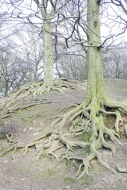
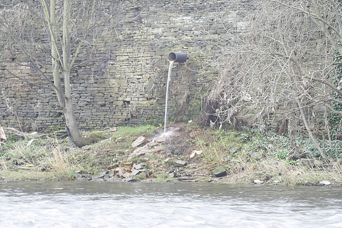
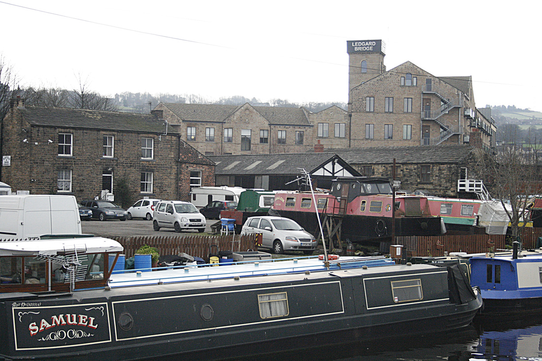
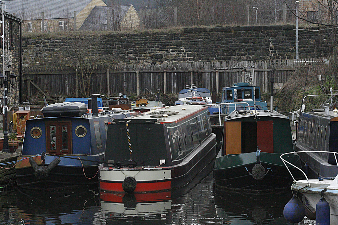
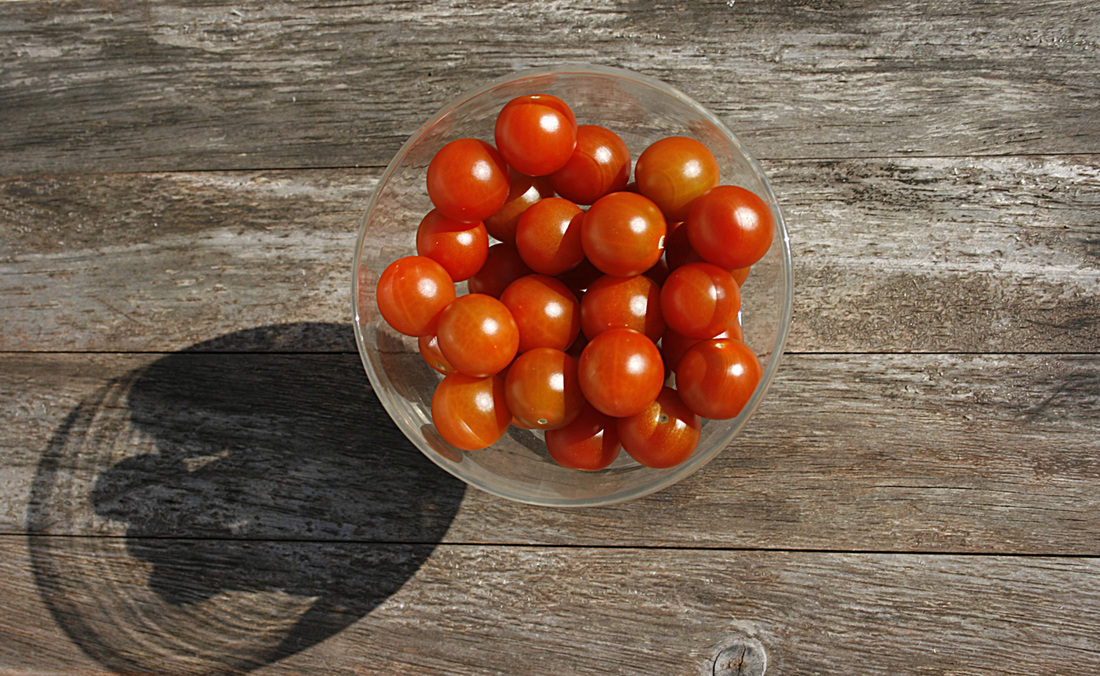
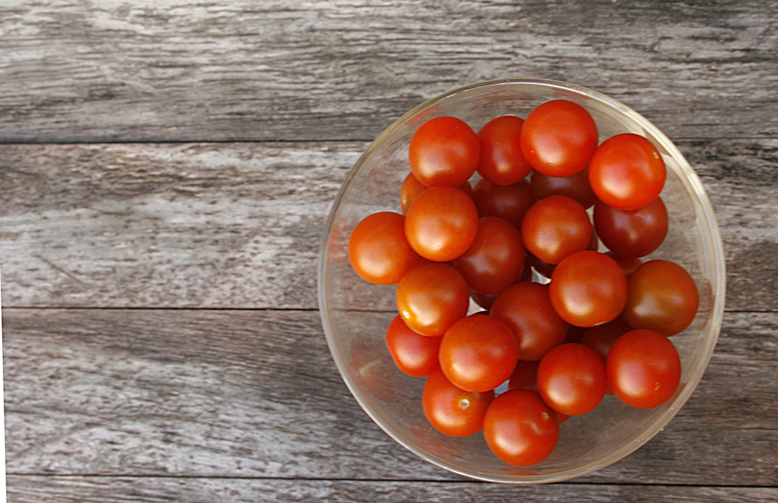
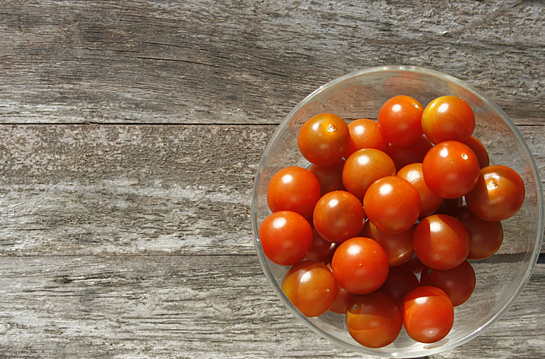
For the purpose of this blog, all photos are low res to ease speed of loading. His res versions are saved to a different file.
Here goes...
Right now, I have some time on my hands and this opportunity presented itself, so I've bitten the bullet and taken the plunge. I have a tutor, I have my first exercises which, in six weeks time, lead to my first assignment. Although this assignment is sent for critique to my tutor, it doesn't form part of my assessment material. The others do.
Flicking through the pages of the first module, I feel confident that I can complete the exercises and the assignments successfully, althought it is immediately apparent that there are many more processes involved in becoming an accomplished, creative photographer than I first thought. Whilst I do try and 'create' every shot I take (I'm definitely not a 'point-and-click' person) there is much I will learn about creative photography. I am nervous but enthusiastic. It has been a long time since I have studied for anything and I am worried about my capacity to absorb new information. I want to learn and I am passionate about photography so I hope that passion will compensate for my tired brain cells.
This blog will account for 20% of my marks. It will detail and catalogue my whole course.
For the purpose of this blog, all photos are low res to ease speed of loading. His res versions are saved to a different file.
Here goes...
PROJECT: GETTING TO KNOW YOUR CAMERA
Exercise: Focal length and angle of view
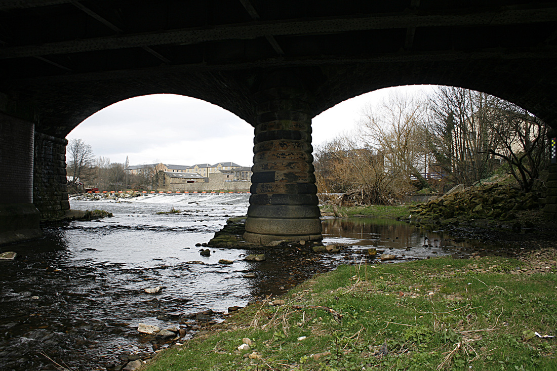
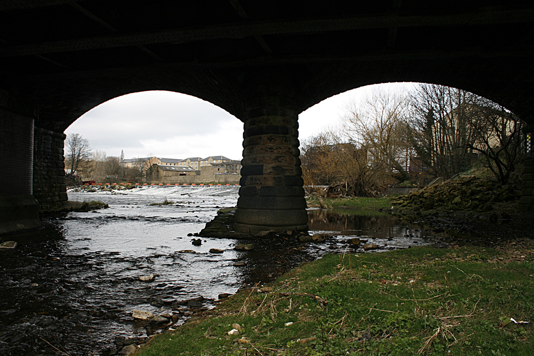
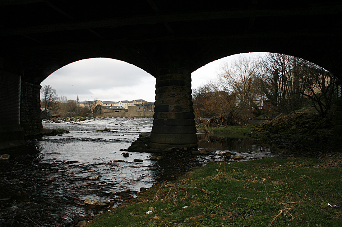
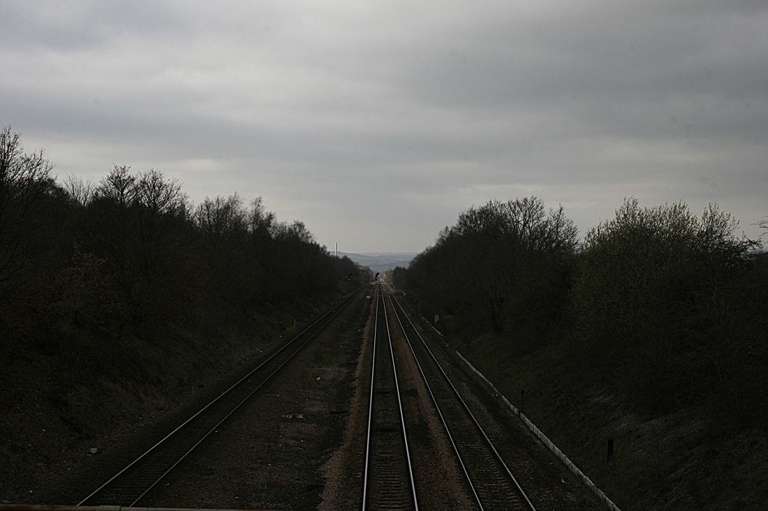
The purpose of this exercise was to demonstrate varying focal lengths. All three shots were taken from the same position on a tripod-mounted camera The first picture was taken with an 18-55mm zoom lens and with both eyes open, one trained on the view finder, the other directly looking at the scene, I adjusted the lens so that, through both eyes, the image was the same size and took the shot. (100th f6.3). I made a note of the lens setting which was 55mm. The second shot was taken with the same lens, same speed and aperture, but this time I zoomed out to the full extent of the lens, making the scene seem further away. The lens setting was 18mm. For the final picture I swapped the lens for a telephoto (80-200mm) and zoomed right in (60th f6.3); the lens setting was 200mm.
I printed each photograph, returned to the same position they were taken from and in each instance positioned the image to the point where it matched the scene. I was surprised (and pleased!) to discover that, when i measured the distance from where the shots were taken to the image, it exactly matched the mm x 10 settings of the lens. 55cm, 18cm and 200cm.
PROJECT: FOCUS
Exercise: Focus
This exercise demonstates how focusing on a different aspect of a scene changes the photograph's feel. With a fixed aperture of f5 (60th) and with the camera tripod mounted to ensure a fixed position for all three shots, I manually focussed on three different parts of the scene.
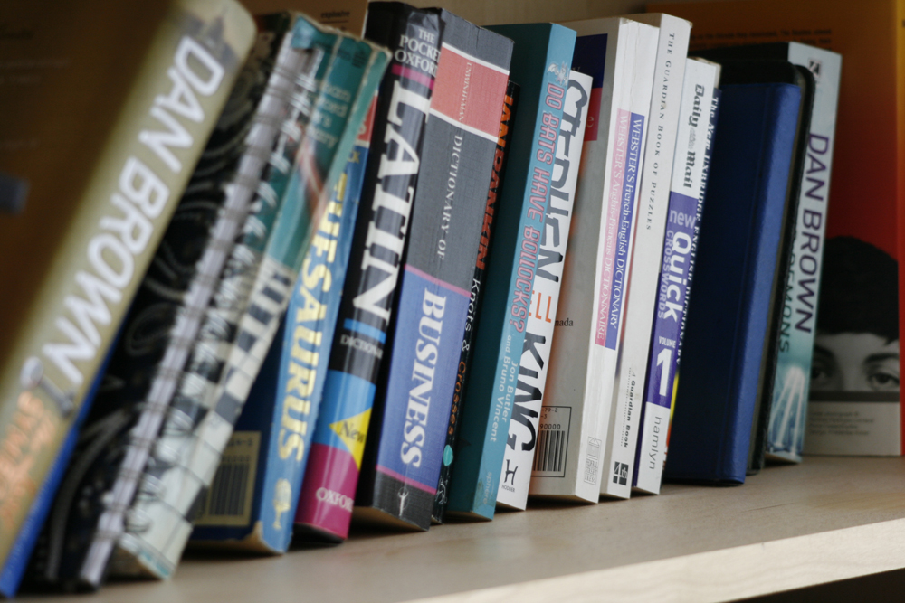
The picture on the left, where the focus is concentrated on the extreme left book seems natural to me (when the foreground is in focus). Having said that, the picture on the right seems to lead the viewer through the image to the book on the extreme right, thus making it a more interesting shot and my favourite of the three. I think this is because naturally, we read from left to right. I feel the middle picture, where the focus is concentrated to the centre, appears flat.
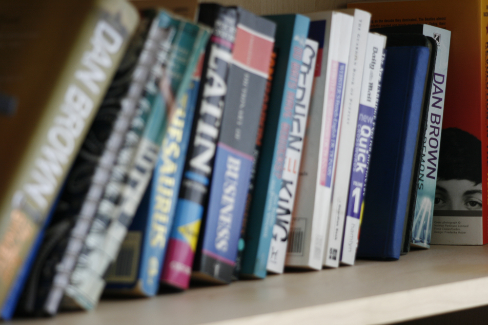
Exercise: Focus at different apertures
This exercise entailed shooting a scene from a fixed point (tripod-mounted) using three different apertures; largest (f5.6 - left picture), mid range (f10) - middle picture and smallest(f5.6) - right picture.
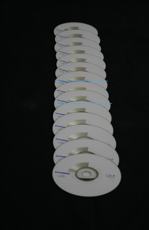
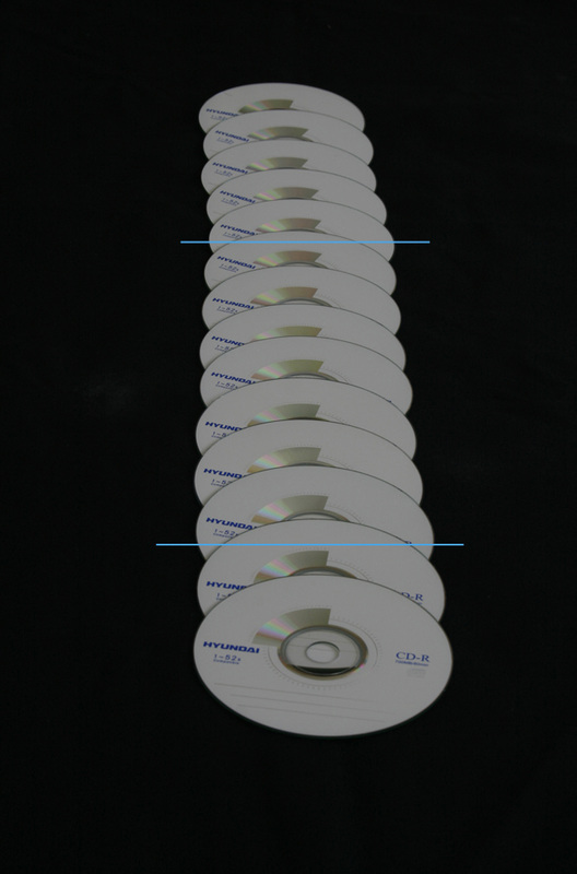
The thin blue lines on the picture show the extent of the sharpness of each image.
PROJECT: PHOTOGRAPHING MOVEMENT
Exercise: Shutter speeds
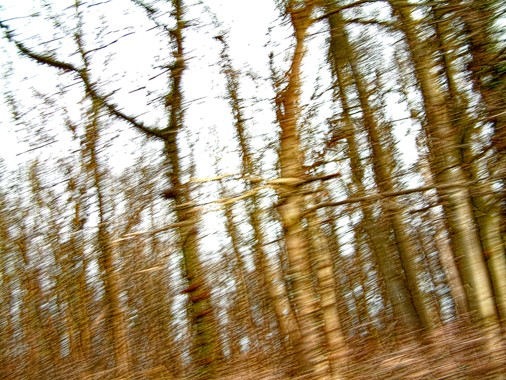
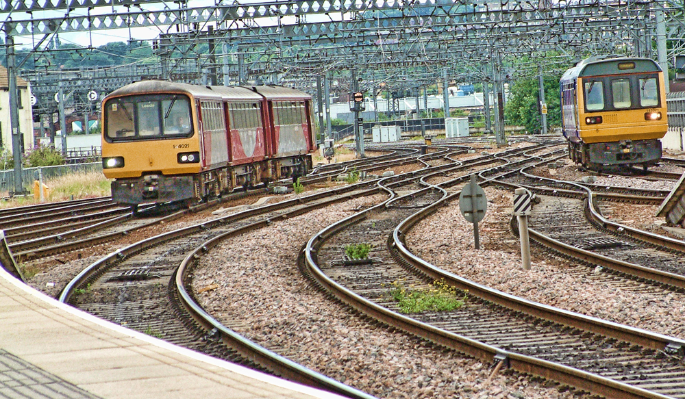
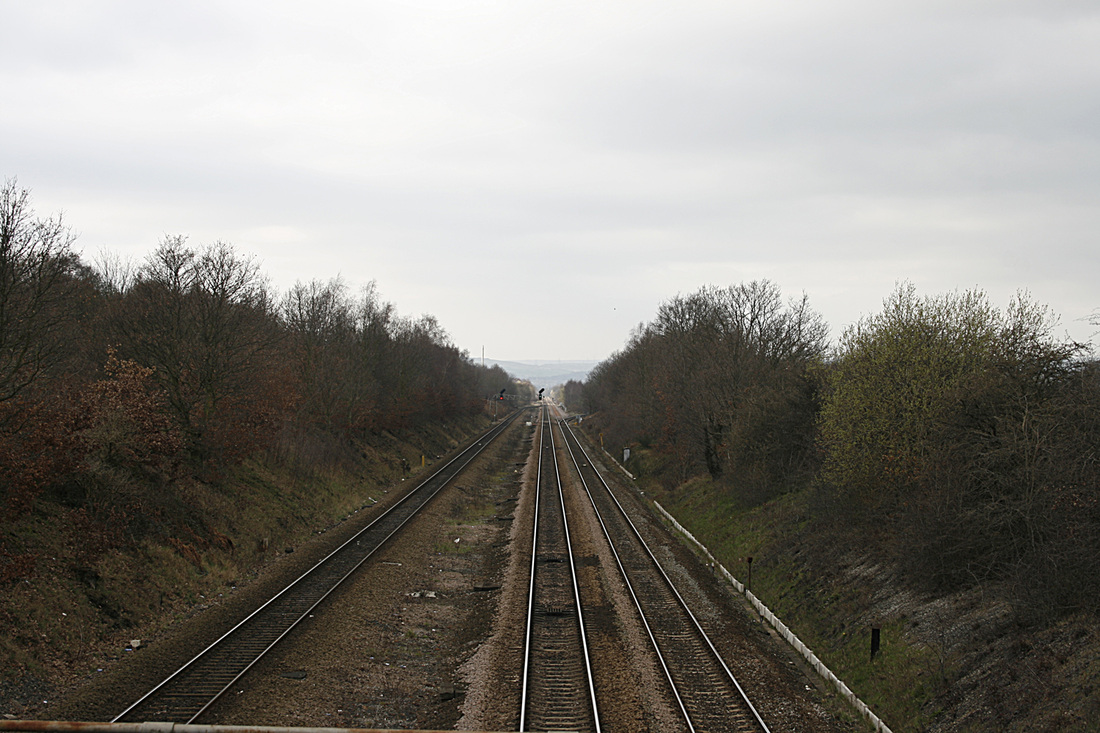
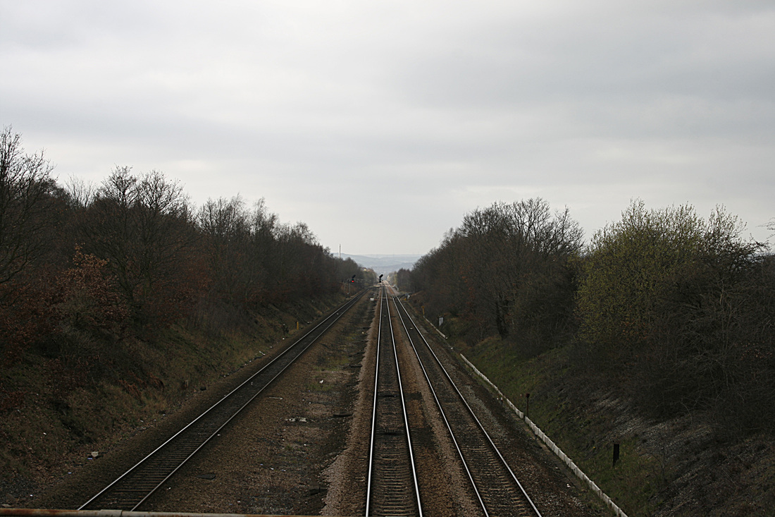
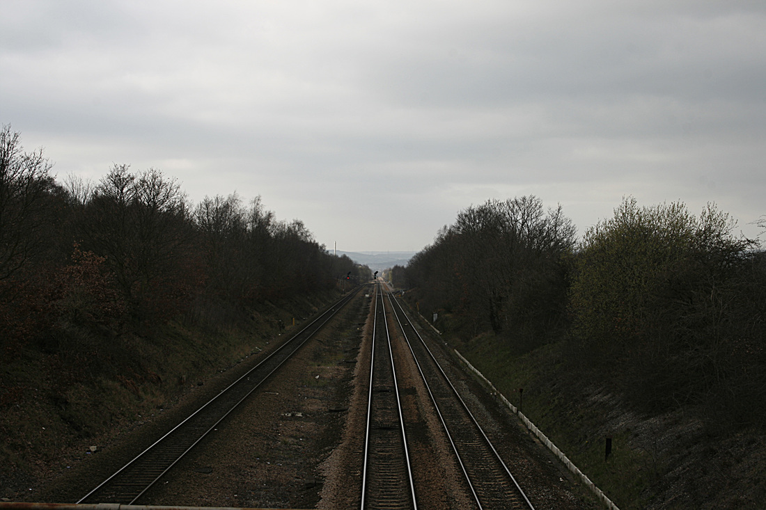
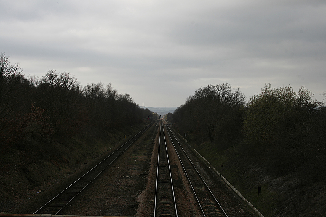
The purpose of this exercise is to illustrate how the shutter speed of the camera can show movement. It also determines the levels of sharpness obtained at different shutter speeds. To complete this exercise I decided to shoot a moving train. The camera was tripod-mounted and in a fixed position so that the train moved across the camera's field of view. The shots are made up of some trains coming from the left, some from the right.
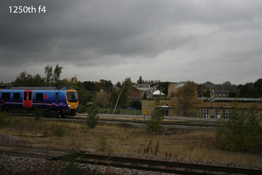
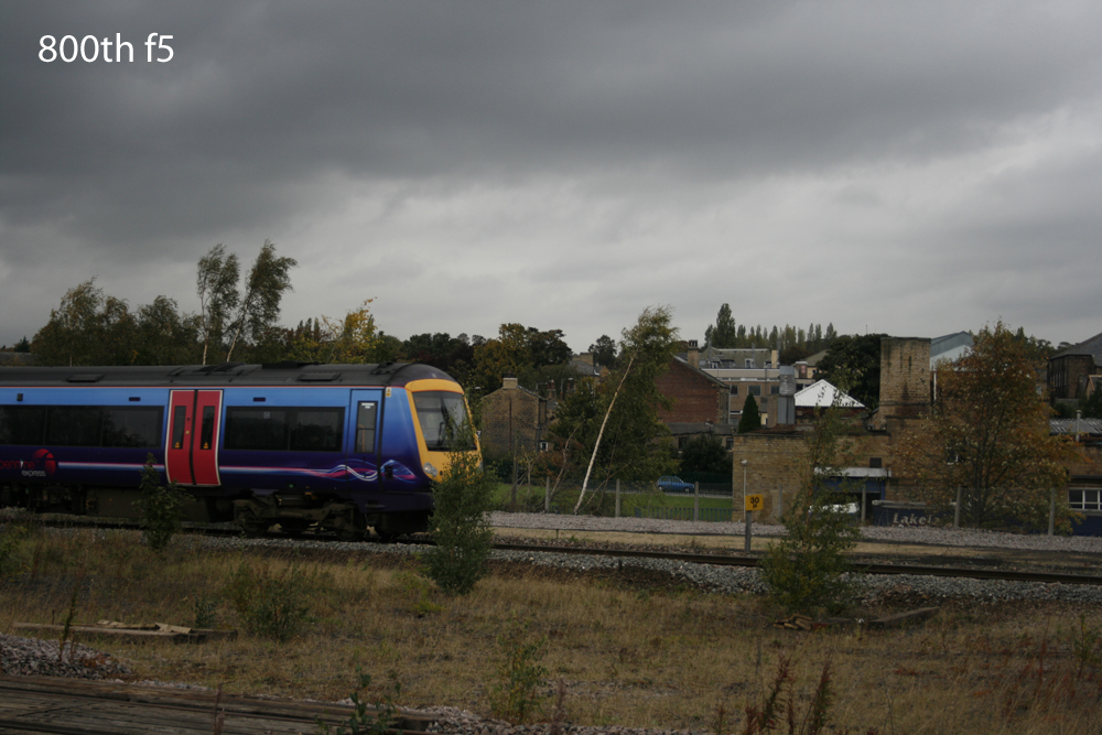
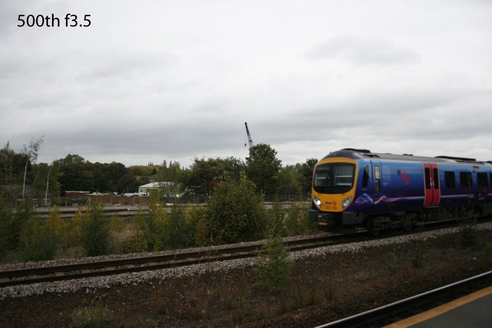
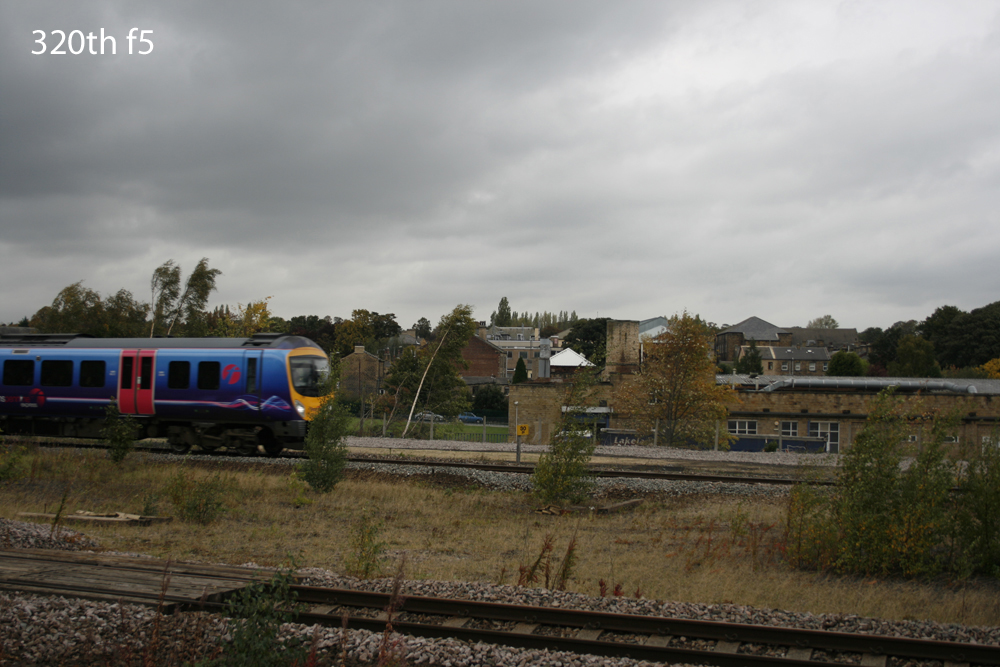
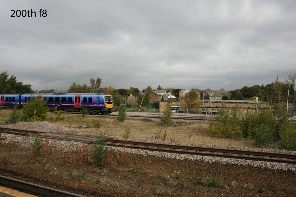
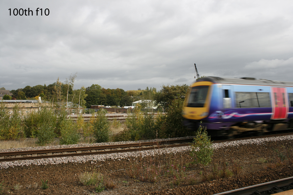
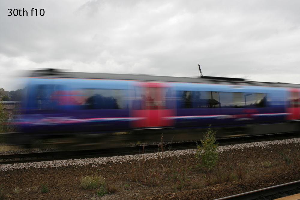
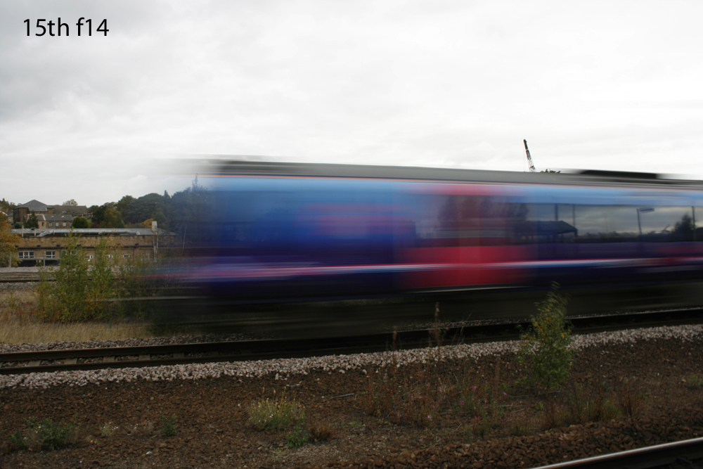
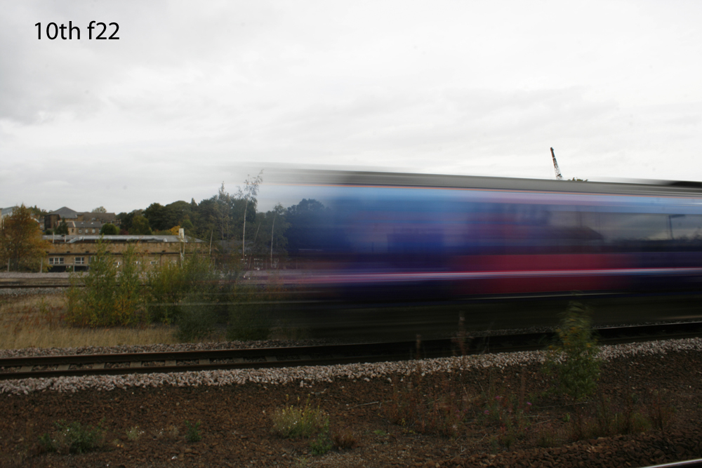
As is apparent, more motion blur occurs the slower the shutter speed. I think a speed of around 200th gives an acceptable level of sharpness, although the photograph lacks the dynamic quality of illustrating movement. My own preference is 30th as this really shows the speeding train at its best. The shot at 100th, in my opinion just looks slightly blurred (as in camera shake) and fails to illustrate movement adequately enough.
Another method of giving the impression of movement is to pan the camera, following the mving object so that it remains sharp whilst the background is blurred.
Another method of giving the impression of movement is to pan the camera, following the mving object so that it remains sharp whilst the background is blurred.
Part 1 - The Frame
Following discussions with my tutor and on his recommendation, I have decided to skip this chapter. I feel that I have a grasp of the skill for framing my shots already. I continually (and as a matter of course), frame all the shots I take and take great care when cropping. Now to my first assignment.
Assignment 1: Contrasts
This assignment, which is not actually submitted for formal assessment, requires me to take eight pairs of shots. Each pair must show contrasting elements; i.e. large/small, many/few, black/white, thick/thin, etc.
| assignment_1_contrasts.pdf |
Part Two: Elements of Design
This part of the course will help me understand more about the basic principles of graphic design in photography and includes topics on Points, Lines, Shapes and Rhythm & Patterns.
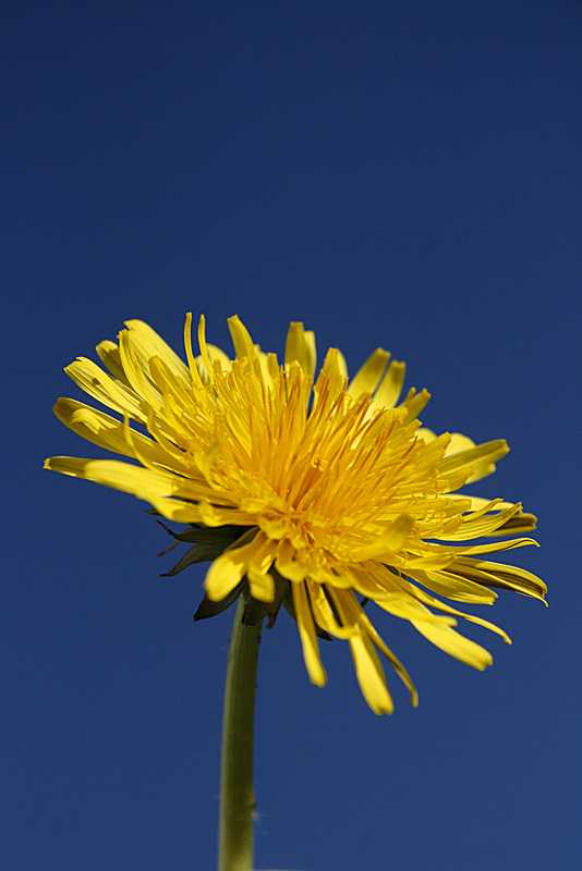
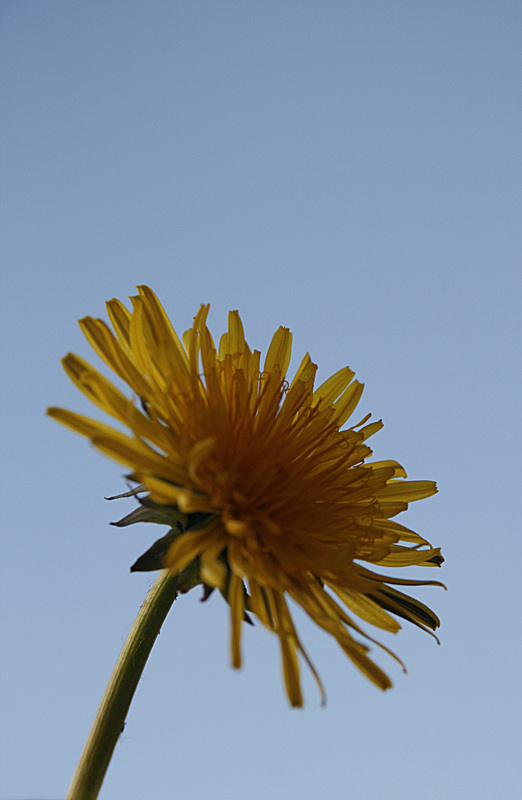
PROJECT: POINTS
Exercise: Positioning a point
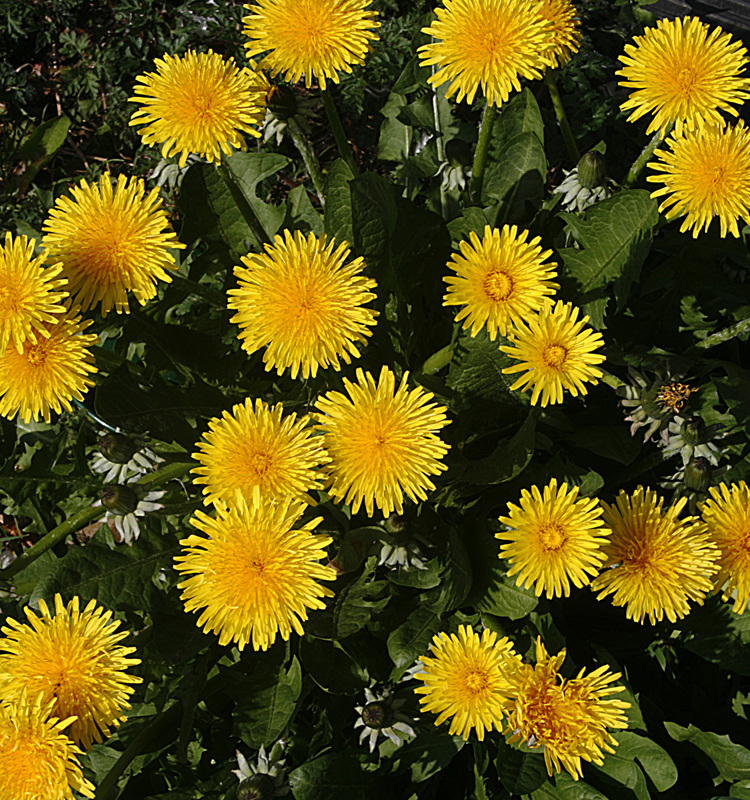
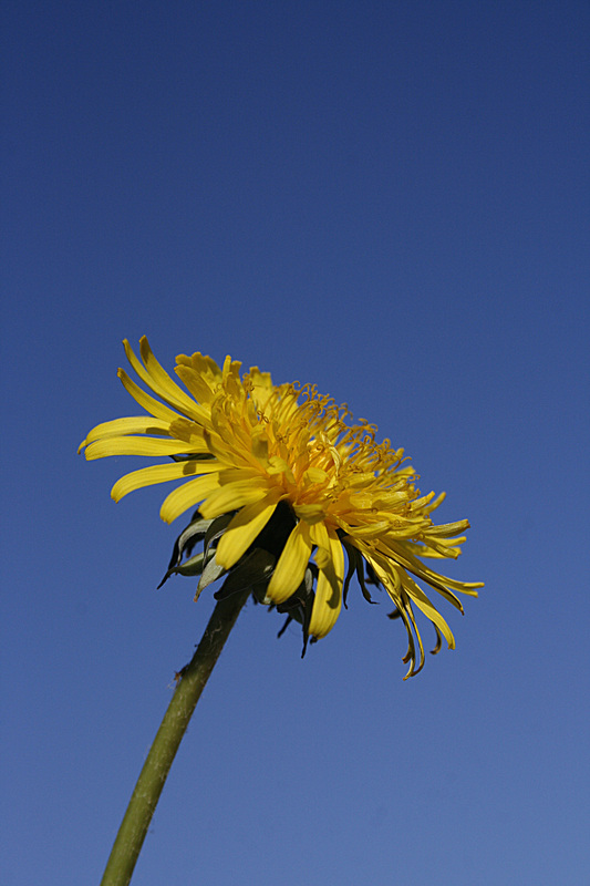
This exercise requires me to consider the different positions in which I place a single point within the frame of three photographs. I chose to use a flowerhead.
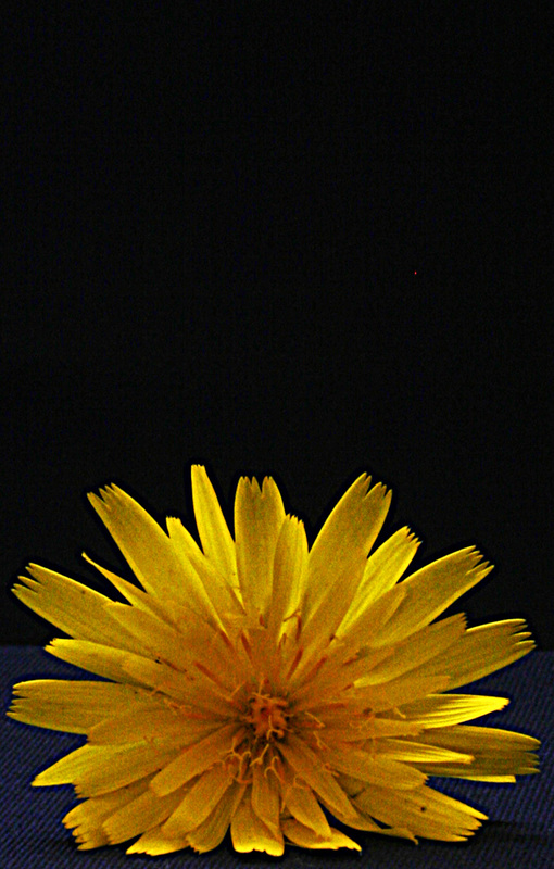
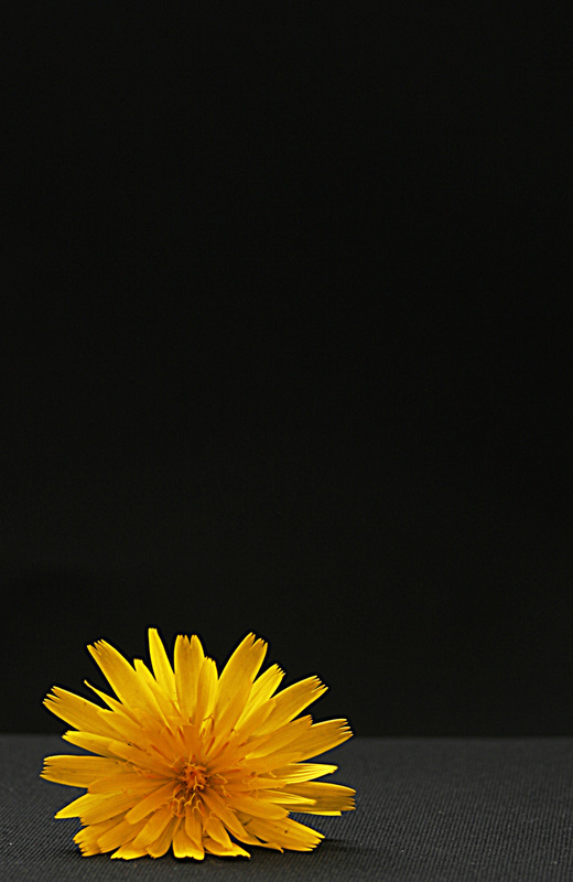
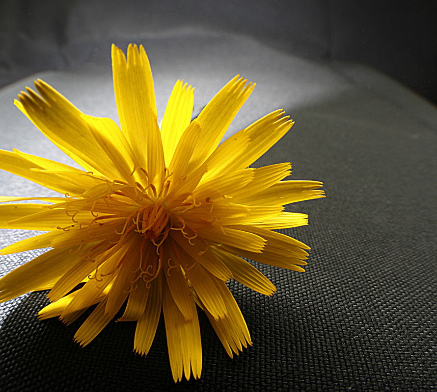
The photograph one the left shows symmetry because the flower is centrally placed within the frame. The centre photograph explores the relationship between the flowerhead and its background, specifically the bright yellow against the black and dark grey. I prefer this to the others because there are more elements to the composition. The photograph on the right, nearly full frame, allows the viewer to examine the detail of the flower and by positioning the flower slightly off centre, it shows the relationship between the yellow and two other shades; light and dark.
Exercise: The relationship between two points
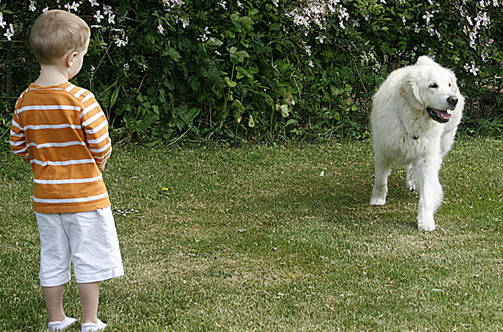
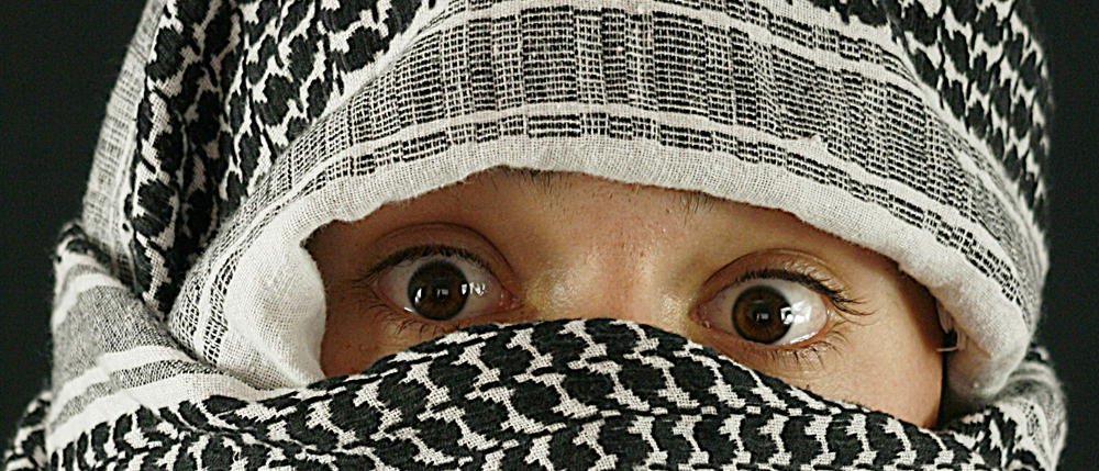
A photograph which contains two points (of interest) needs to be carefully composed, so that each point of interest balances the other. Whilst this is a concept I fully understand, I don't particularly like this type of photograph, nor do I understand the exercise in the module folder. It asks for three photographs, then asks for two situations. So does that mean six photographs? How will the photographs differ from one another? Here is a 'two-points' shot and I think both points are of equal priority due to the fact that the child (foreground) has his back to the camera, whilst the dog (background) is facing the camera. Also as the child is looking at the dog, the two points are linked by his line of sight. I opted to take a shot of a face, concentrating on the eyes for my second shot.
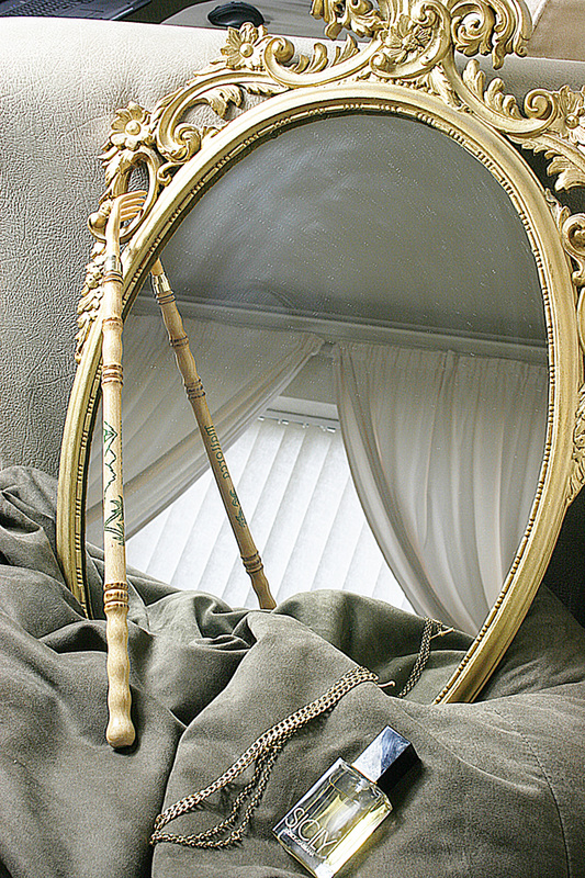
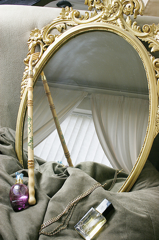
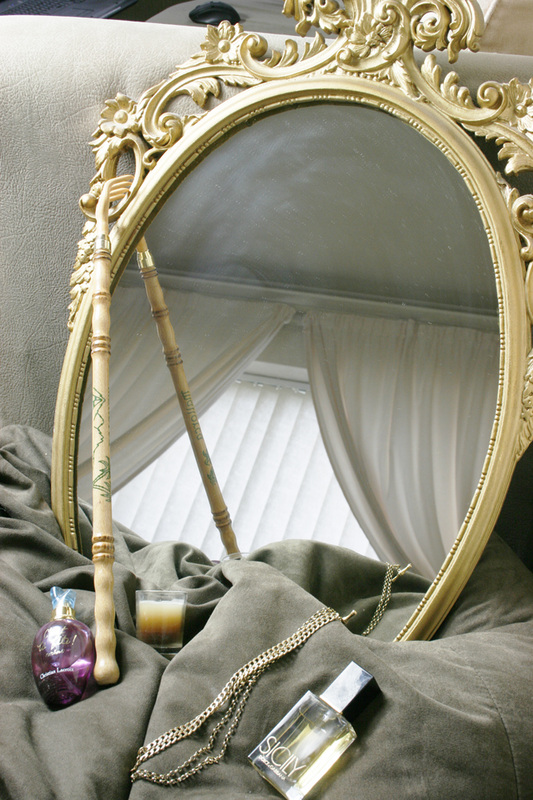
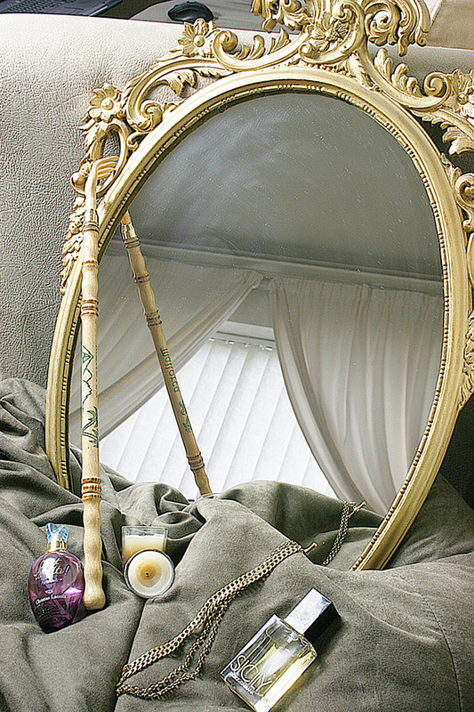
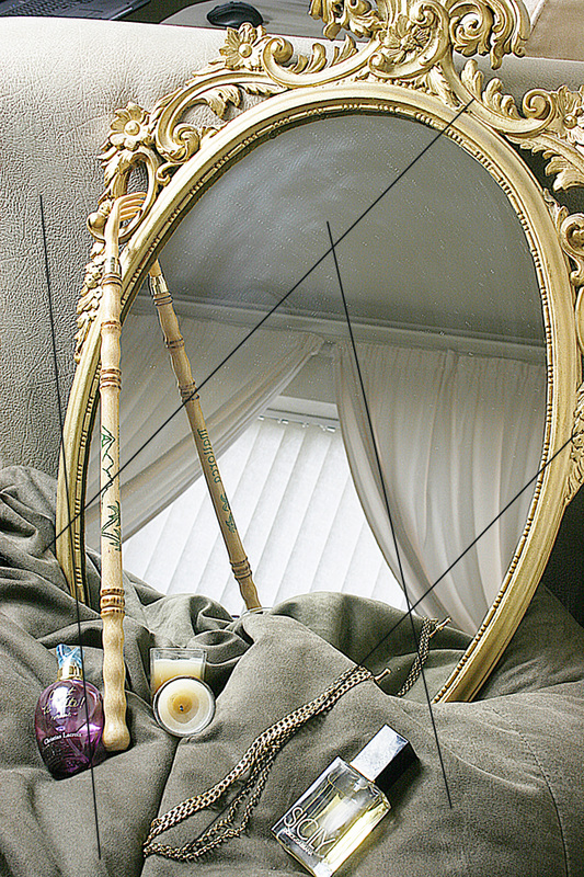
Exercise: Multiple points
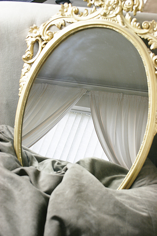
This still life exercise requires me to 'build' a photograph by arranging items in a series of shots. I tried to make each item relate and decided to feature an ornate mirror as the main subject. The reflection was carefully chosen to compliment the scene, as indeed were the colours of the items. The last photoraph show how I interpret this relationship (I have drawn converging lines) The central shape is that of a diamond.
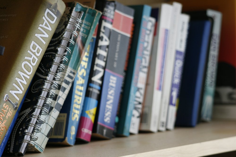
Current reading list

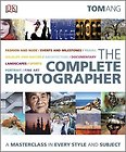
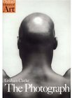
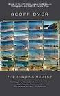

Here is my current reading list. I find the Tom Ang books (first two) particularly useful as reference guides. They are both packed full of innovative ideas and tips. The third book, 'The Photograph' by Graham Clarke came with the course pack. I find it hard work and very wordy. It does make me think more deeply about what a photograph means, however, I don't agree with some of the statements the author makes. Geoff Dyer's 'The Ongoing Moment' was recommended by my tutor, Pete (thanks!). At the time of writing, I have just ordered it from the internet (£7.28 - New). The last book, 'Photo Ideas Index' by Jim Krause is once again an invaluable reference aid and in my opinion, essential for anyone interested in photography.
PROJECT: LINES
Exercise: Horizontal and vertical lines
To complete this exercise, I need to find scenes or situations that display obvious lines in their composition. This first set of photographs were composed for their horizontal lines whilst the second set represents vertical lines thinking.
Exercise: Diagonals
Here I need to show four photographs which display diagonal lines. I think this is simple to achieve because perspective provides diagonal line naturally. What is more difficult, is to exaggerate those lines.
I note from reading Geoff Dyer's 'The Ongoing Moment' (p.21 pic 4 Walker Evans New York 1938) A typical example of the use of diagonals in a photograph. Another example from the same book can be seen on p. 108 - Dorothea Lange - 'Jobless on Edge of Pea Field'.
I note from reading Geoff Dyer's 'The Ongoing Moment' (p.21 pic 4 Walker Evans New York 1938) A typical example of the use of diagonals in a photograph. Another example from the same book can be seen on p. 108 - Dorothea Lange - 'Jobless on Edge of Pea Field'.
Exercise: Curves
Here are three examples of photographs that I wanted to take with curves as the basis of their composition.
Exercise: Implied lines
The two photographs shown in 'The Art of Photography' workbook (p.68) both have implied line in the form of circles.
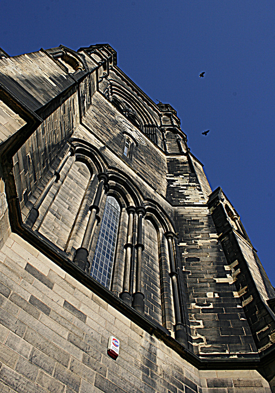
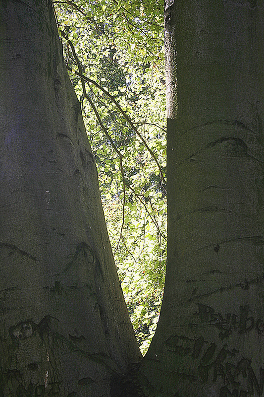
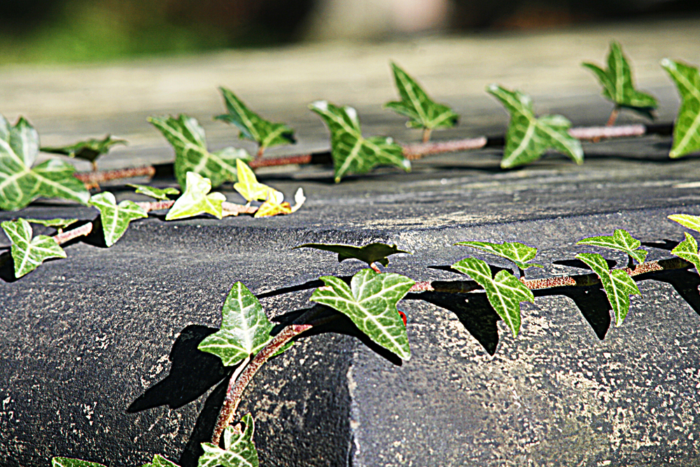
Exercise: Real and implied triangles
The first photograph illustrates real triangles. Several in fact! This shot was taken to deliberately feature triangles.
Making triangles by perspective I found fairly easy (If I have grasped the concept correctly!) Certainly if the apex of the triangle is at the top. I visited our local church and angle the camera to look up the church tower, thus creating an angled perspective. I have chosen to take two shots to illustrate my understanding of an inverted triangle; one shows a view through a tree with a split trunk, the other is another perspective-inspired shot of a tomb in the same church's graveyard. Whilst the shot of the tomb strongly features the vibrant green ivy, I still think the corner of the tomb makes the eye follow the lines of the 'triangular' shape. Does it work for you?
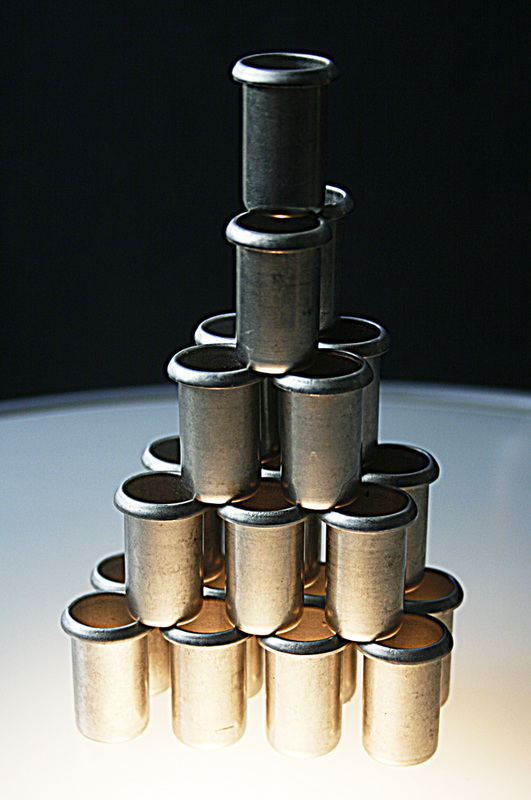
The next series of photographs represent implied triangles. I wanted to do something out of the ordinary here, so the first photograph, with the apex at the top, I wanted to make 3-dimensional. I use steel 20mm plastic pipe stiffeners, built into a pyramid shape and lit from below with a small halogen light and from above with a softbox.
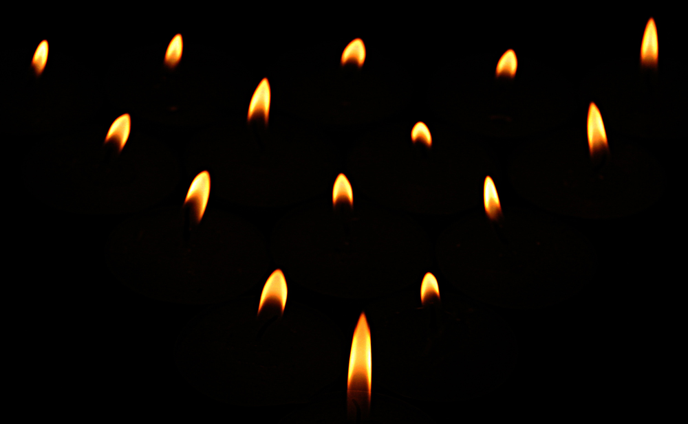
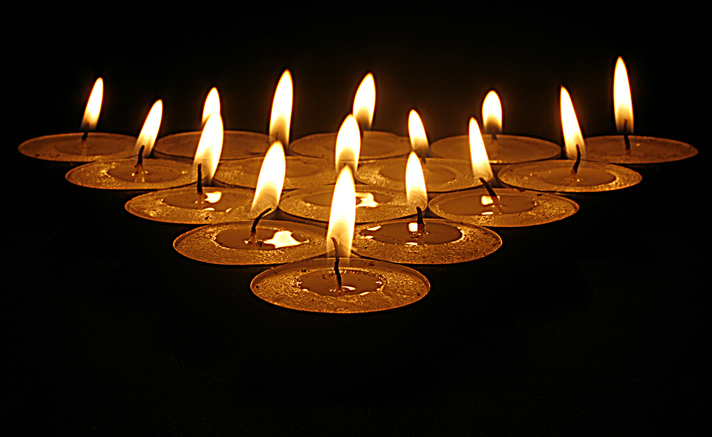
The next two photographs are of tealights. I have opted to show two versions as I liked both. One was just of the flames ( I would have liked this shot to be more symmetrical, but you can't control the height of flames!). The second was shot at a lower angle to accentuate the 'triangle'.
The next two photographs are of tealights. I have opted to show two versions as I liked both. One was just of the flames ( I would have liked this shot to be more symmetrical, but you can't control the height of flames!). The second was shot at a lower angle to accentuate the 'triangle'.
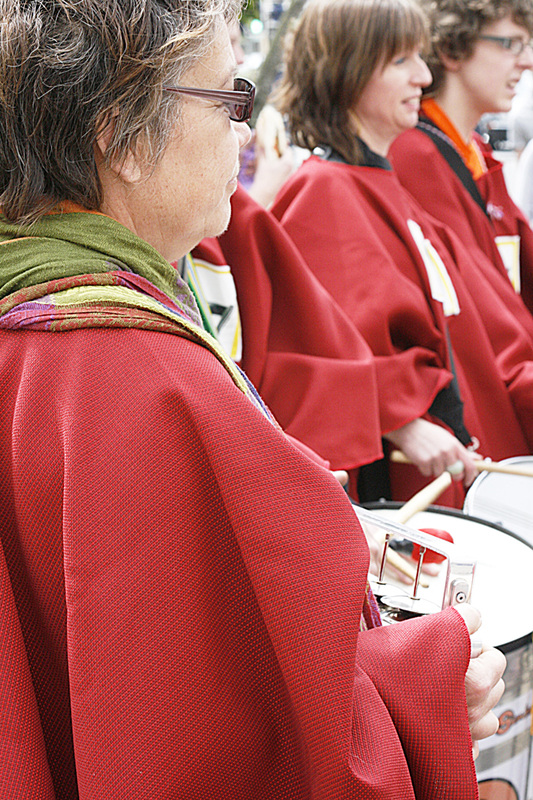
This photograph below shows how I have composed the shot by arranging three people in a group in such a way that their positions imply a triangular shape.
PROJECT: RHYTHMS AND PATTERNS
Exercise: Rhythms and patterns
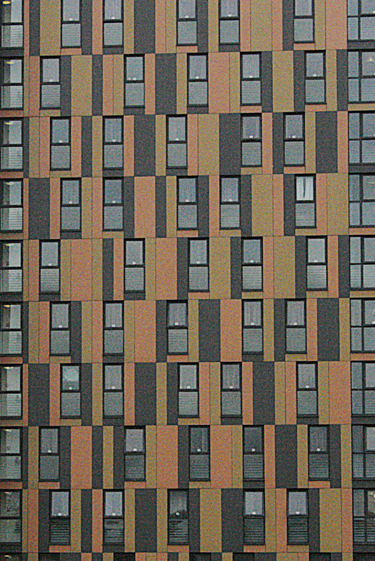
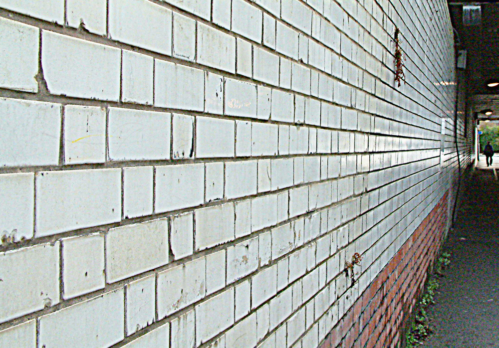
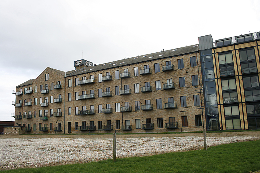
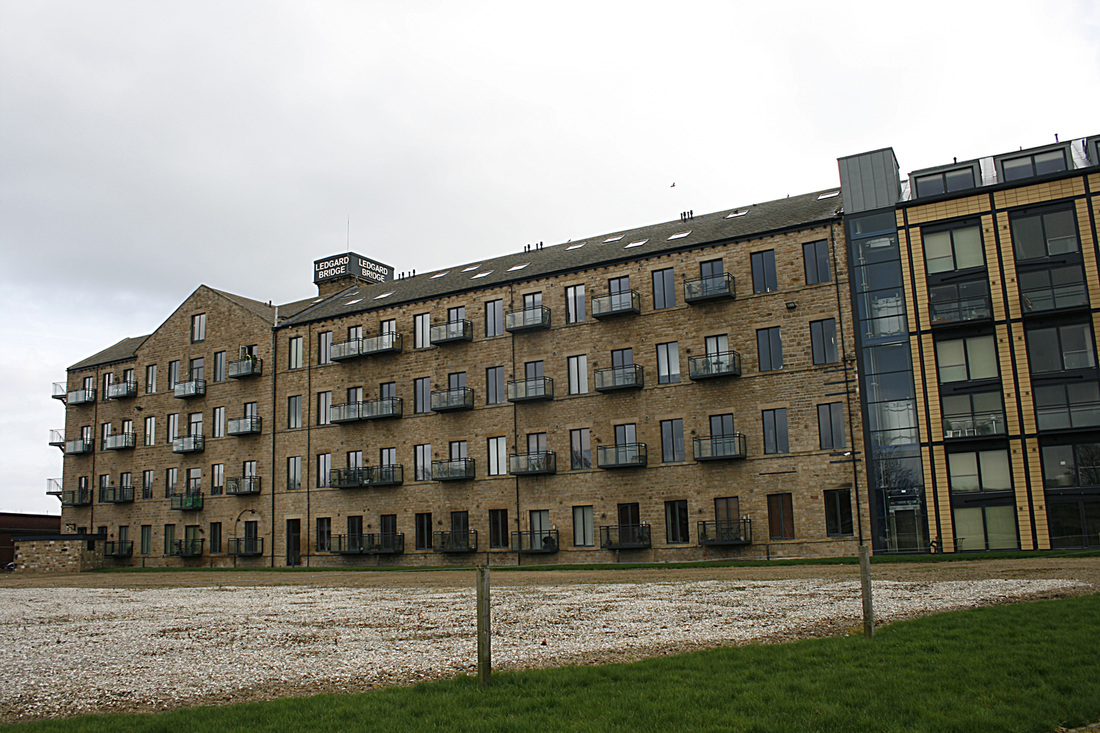
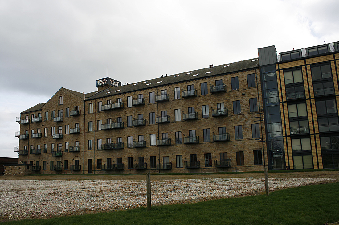
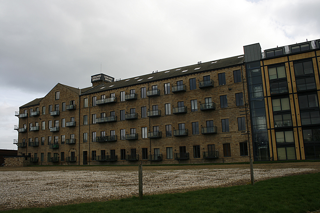
I was in Manchester recently and saw this apartment block which displayed all the attributes necessary for a great pattern shot. Using a 70-200mm telephoto lens, I shot a section of the building and later cropped it to give this result:
This second shot, which I know is technically not good at all, but I chose to use it to illustrate rhythm. The pattern of dirty white tiles leads you eye through the shot to the 'light at the end of the tunnel', or indeed the person walking at there.
Assignment 2: Elements of design
Ho hum...ho hum. Deliberating, deliberating, deliberating. I have spent the last week trawling the internet for ideas and inspiration and as this is the first assignment that will count towards my degree assessment, I so desperately want to get this right. I am torn between choosing one of three subjects. Do I opt for 'Flowers and Plants', 'Street Details' or one subject of my choice, which would be 'People' (or parts thereof}? I don't want to preempt anything that will follow in ensuing modules (People), but I have some nice ideas for this assignment. I'll muse on it a little longer...
Here it is
| assignment_2.pdf |
Part Three: Colour
Really looking forward to this section, where I'll put my knowledge of colour control to the test and how different colours relate to each other and form an important part of design in photography.
Exercise: Control the strength of a colour
Camera is set at 1/60th and the following five shots are shot with different apertures. The exercise demonstrates how using different apertures affects the strength of a colour. The camera's own meter recommended 1/60th at f5.6 as the ideal setting, so the sequence is as follows: f4, f4.5, f5.6, f6.3, f8.


Exercise: Primary and secondary colours
Here are a series of shots in which each of the primary and secondary colours dominate.
Exercise: Colour relationships
This exercise shows how typically, colours relate to each other and the ratios that work best. For instance: red and green share equal dominance, orange and blue have a ratio of 2:1 and yellow and violet 1:3.

Part two
The second part of this exercise requires me to produce a number of photographs with a colour combination which I find particularly pleasing. The shot on the left combines the rich colours of blue and red with a ratio of possibly 4:1. The picture in the middle illustrates a 1:2 ratio of violet and green and the picture on the right, a 1:1 ratio of yellow and green. I think it true to say that any combination of colours (and shades) can work well, even if they clash to some degree.
Exercise: Colours into tones in black and white
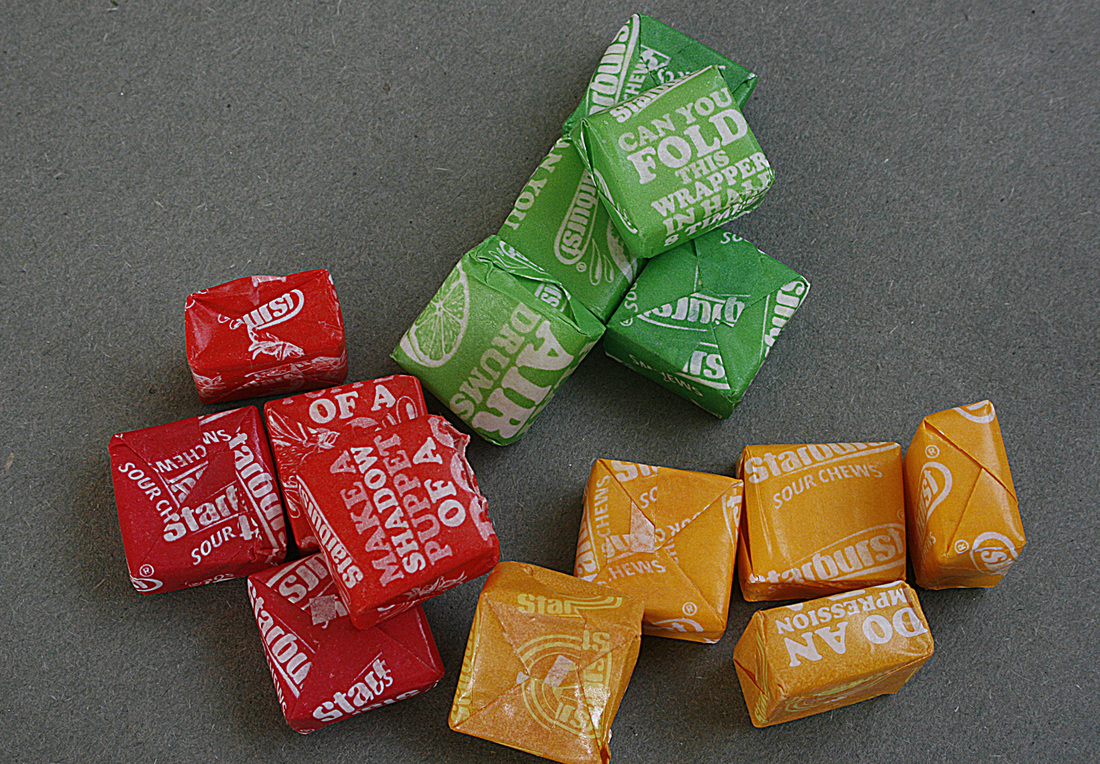
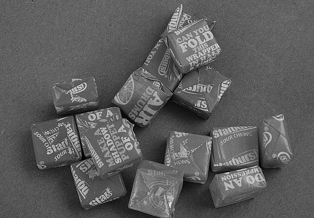
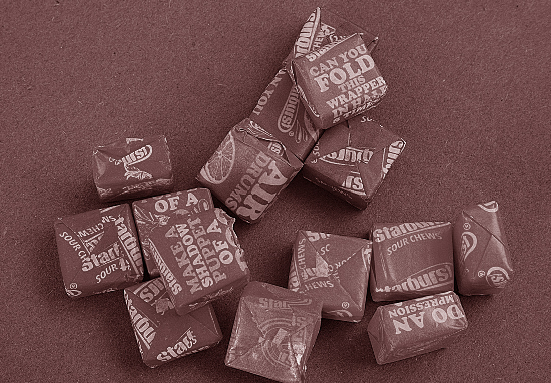
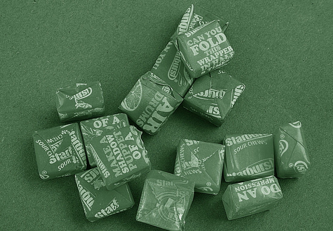
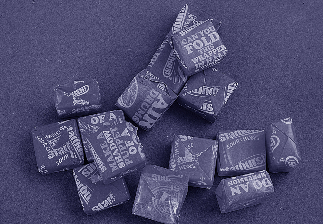
This exercise shows how different effects can be achieved by adjusting the colour tones in a black and white image, thus replication the use of colour filters with black and white film. I shot a still life of some red, green and yellow sweets in colour, then desaturated the shot in CS2. Then I intensified the red, green and blue filters respectively. Here are the results.
Very useful book on colour relationships. Jim Krause's Colour Index

This book Colour Index, by Jim Krause is very useful. It shows throughout, which colours work with each other. Mainly used by graphic designers, I would recommend this for any photographer who works with and enjoys the relationship with different colours. I purchased my copy on eBay for a few pounds.
Part Four: Light
I am also looking forward to this section as I already use light in my photography to a great extent, especially indoors. I am aware that this section emphasises 'outdoor light', which I also use.
Exercise: Part One - Measuring exposure
Below are four photographs taken on a tripod. To maintain the correct depth of field, I changed the speed setting on each one and maintained the aperture at f14 (ISO 100). I think all four photographs are acceptable. The darker shots give a spooky, almost scary type feel to the scene whilst the lighter two give the impression of perhaps a more enchanting, fairy-like forest.
1/10th
|
1/6th (Ideal exposure)
|
0.4 sec
|
0.8 sec
|
Exercise: Part two
The second part of this exercise requires me to shoot a number of subjects, each with five exposures with varying aperture settings. Basically, bracketing x 5 stops.
1/8th f10
|
1/8th f11
|
1/8th f13
|
1/8th f14
|
1/8th f16
|
1/20th f6.3
|

1/20th f7.1
|
1/20th f8
|
1/20th f9
|
1/20th f10
|
1/30th f8
|
1/30th f9
|
1/30th f10
|
1/30th f11
|
1/30th f13
|
1/80th f6.3
|
1/80th f7.1
|
1/80th f8
|
1/80th f9
|
1/80th f10
|
1/60th f10
|
1/60th f11
|
1/60th f13
|
1/60th f14
|
1/60th f16
|
The above exercise illustrates that varying the exposure doesn't necessarily mean the shot is unacceptable. In some instances, a darker or lighter (than average) exposure can benefit the shot.
Exercise: Higher and lower sensitivity
Basically, this exercise shows how the ISO settings on the camera work. The lower the ISO setting, the more clarity in the image. The higher the ISO setting, the more noise and grain in the image. I find that I use higher ISO settings in low-light situations, as the camera will shoot either with a small aperture or at a faster speed. Also, a photograph sometimes works better with a little grain, especially in black and white.
ISO 100
|
ISO 1600
|
ISO 100
|
ISO 1600
|
ISO 100
|
ISO 1600
|
ISO 100
|
ISO 1600
|
ISO 200
|
ISO 1600
|
Exercise: Judging colour temperature 1
With my camera's white balance set for daylight, I took three shots to complete this exercise. Just look how the images differ when taken with the same camera settings in the following situations. The first image (l) was shot in midday sunlight, the middle shot at the same time, but in shade. The third shot (r) was taken in the sun, at the time the sun was just about on the horizon. This later time of day is my favourite and provides the greatest warmth of colour. I find that midday sun is very harsh and creates extremes of brightness and shadow.
Midday in the sun
|
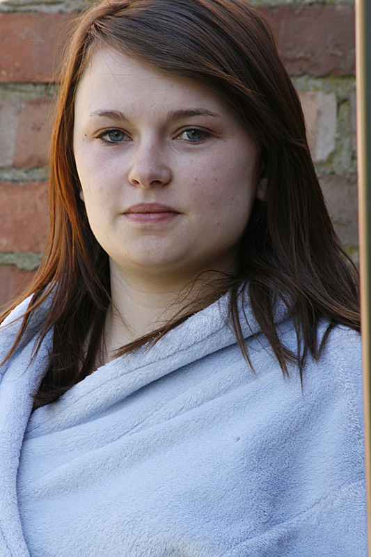
Midday in the shade
|
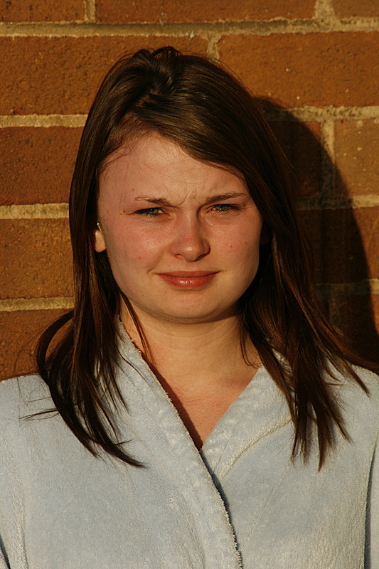
Whilst the sun was setting
|
Exercise: Judging colour temperature 2
Having never really explored the white balance settings on my camera, this exercise was quite an eye opener. Below are sets of photographs which have been taken with different WB settings. Midday (sunlight setting), midday (shade) and as the sun was setting, three similar shots using the auto WB setting.
Midday sunlight with 'sunlight' setting
|
Midday shade with 'shade' setting
|
Low sun with 'auto' setting.
|
Midday sunlight with 'sunlight' setting.
|
Midday shade with 'shade' setting
|
Low sun with 'auto' setting
|
Midday sunlight with 'sunlight' setting
|
Midday shade with 'shade' setting
|
Low sun with 'auto' setting.
|
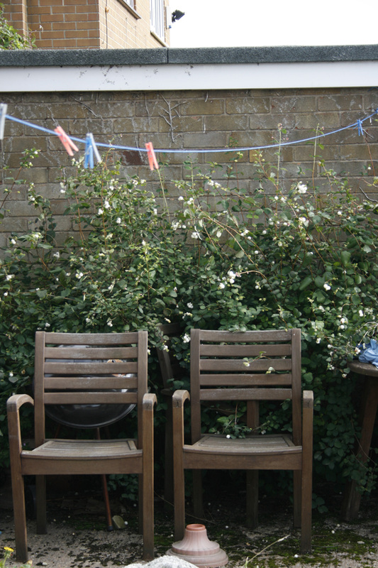
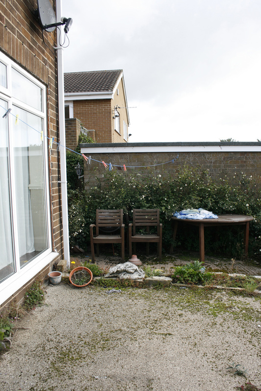
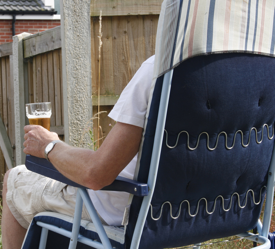
Exercise: Light through the day
This is an interesting one. Take a scene on a sunny day, shoot it from the same position at hourly intervals, then compare the results. Scene picked, next door's garden shot from a tripod mounted camera in a fixed position from my bedroom window! I chose this scene as it is ideal for this exercise. Lots of colour, many highlights and plenty of shadow. All shots taken at ISO100 at f14. Speeds varied slightly throughout the day. Here they are.
0700hrs. Sun rising yet garden still in shadow. Quite dull and flat.
|
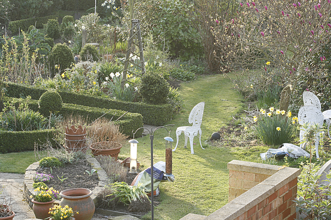
0800hrs. Sun hits the garden in a stripe, but still looks a little insipid and a little lighter than an hour ago.
|
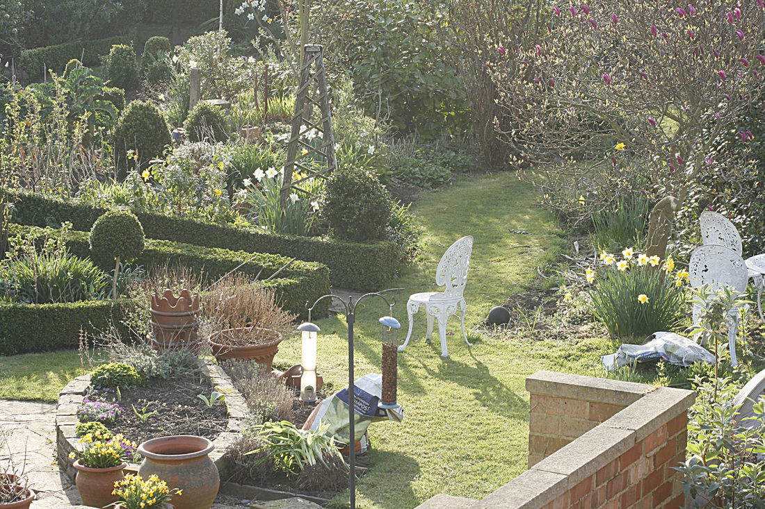
0900hrs. More sun, more shadows (compare the white chair to an hour ago). Colours have lost their richness a little here due to haziness.
|
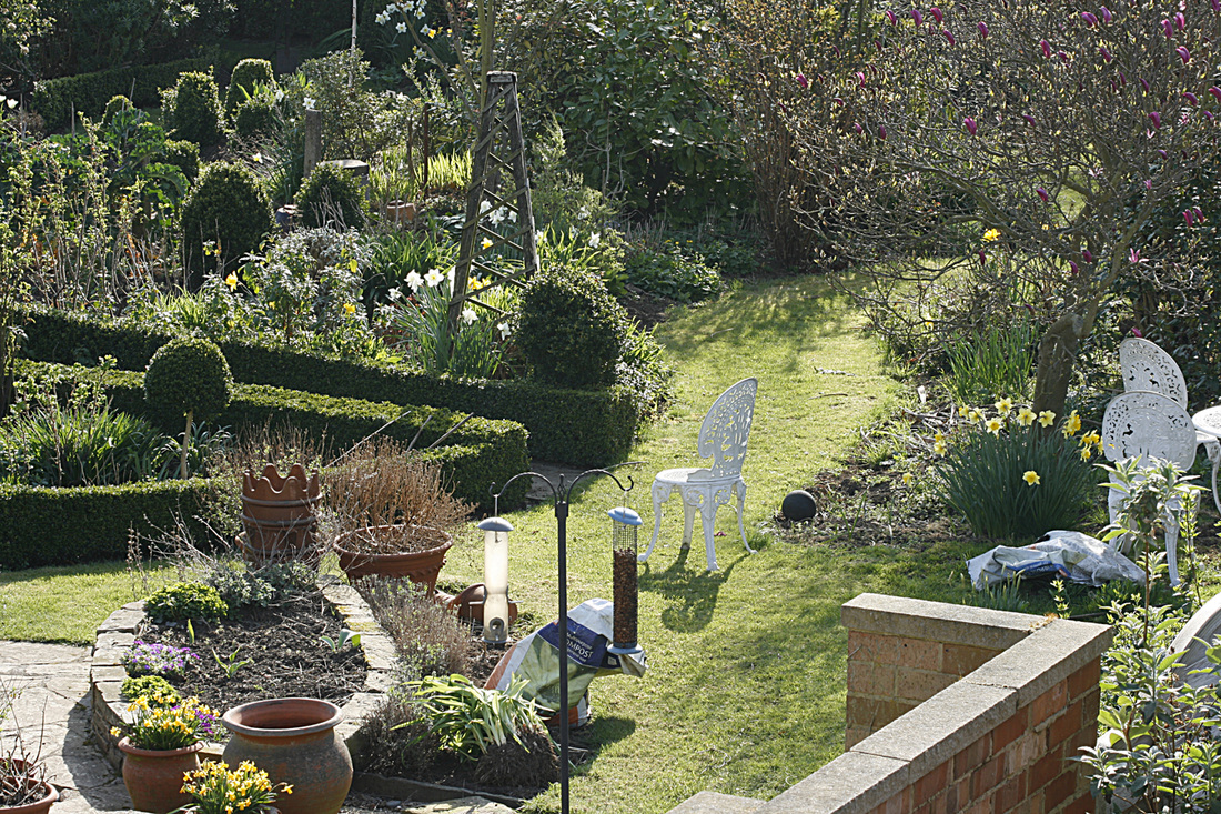
1000hrs. Much more contrast between highlights and shadows. Probably too much. I would need to adjust the curves in this shot.
|
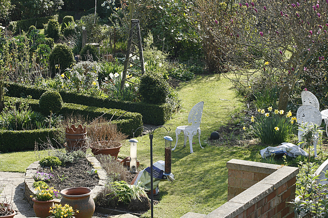
1100hrs. Not too much difference to an hour ago, but the sun is quite strong and the lighter objects have bleached out a little.
|
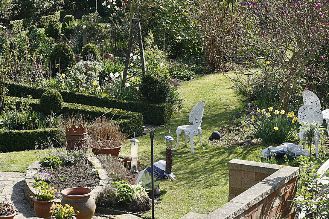
1200hrs. Quite a nice balance of light and dark. The background has more clarity and the shadows are more defined.
|
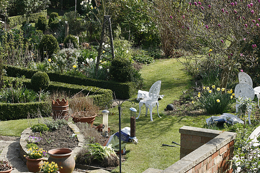
1300hrs. Again, as an hour ago, the sun in in such a position that it has highlighted the background area nicely giving depth to the scene.
|
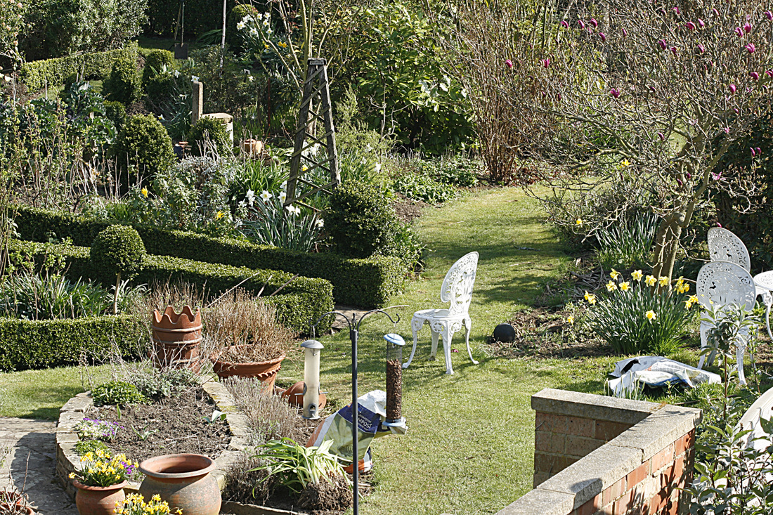
1400hrs. As the sun swings around the scene, the foreground is losing clarity at the expense of the background.
|
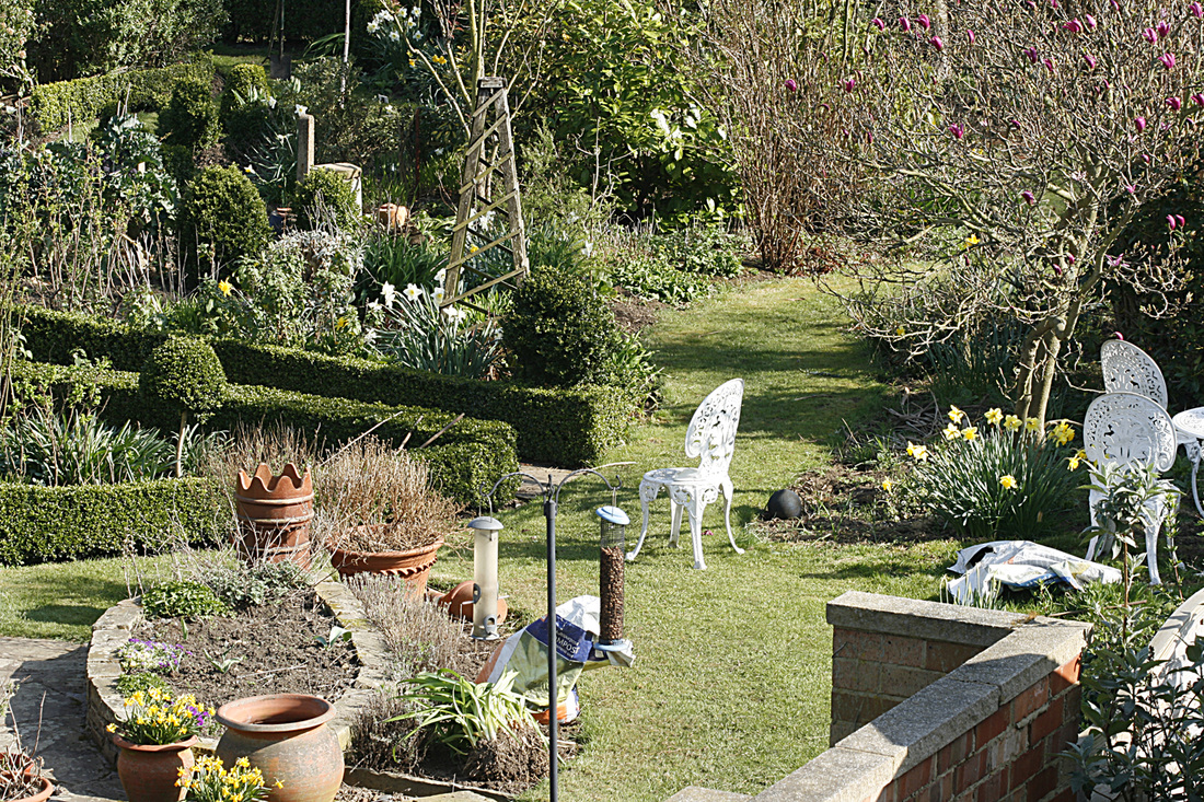
1500hrs. Shadows now being cast to the left and appear quite harsh.
|
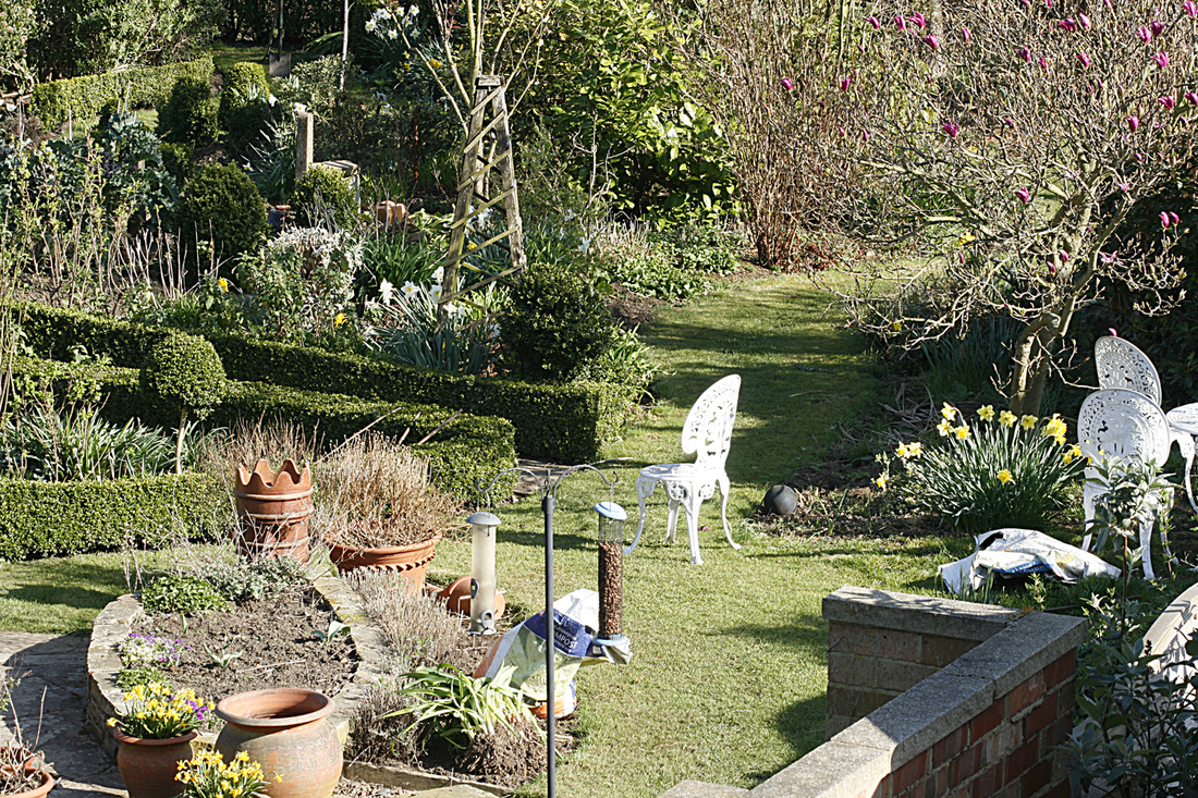
1600hrs. Not an ideal shot in my opinion, but better than an hour ago with less harsh foreground shadows.
|
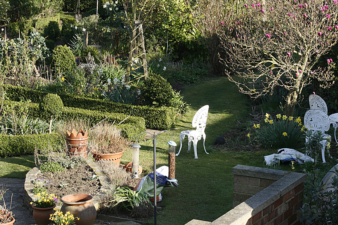
1700hrs. Half the garden is now in shadow and looks uninteresting. I would crop this shot to just the sunlit area.
|
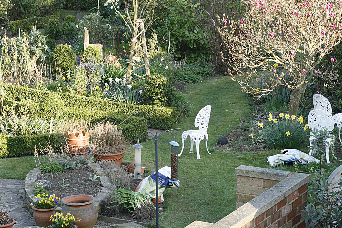
1800hrs. Quite pleased with this one. There is an even balance of highlights and shadows in both the foreground and background.
|

1000hrs. My favourite. i was surprised as I usually prefer to shoot either first thing or last thing as the sun is low. In this instance, the sun has lit the background to give the scene a nice depth and the foreground shadows work to the benefit of the shot.
Exercise: Variety with a low sun
Light behind the camera
|
Light from right of camera
|
Light from front of camera
|
Edge lighting
|
