Exhibition Success!
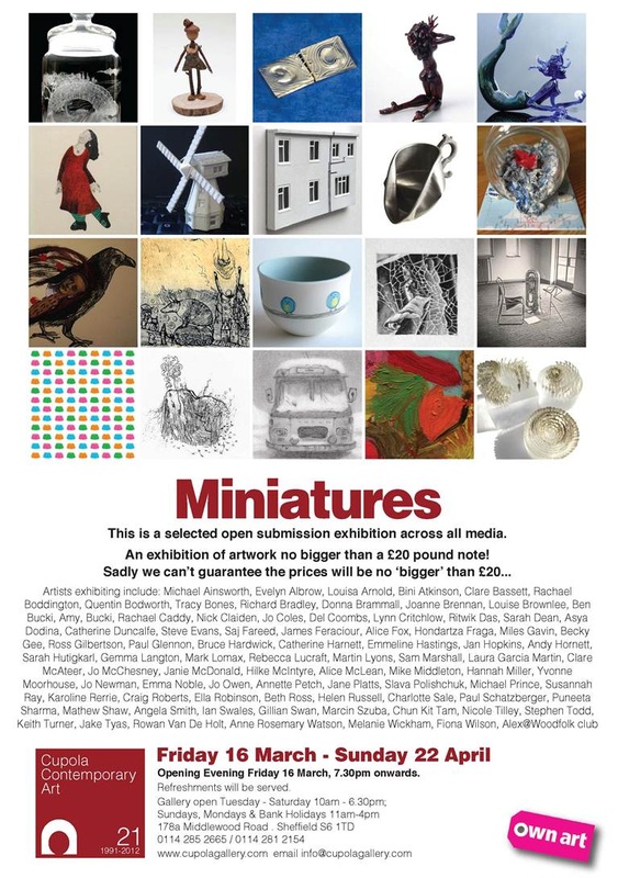
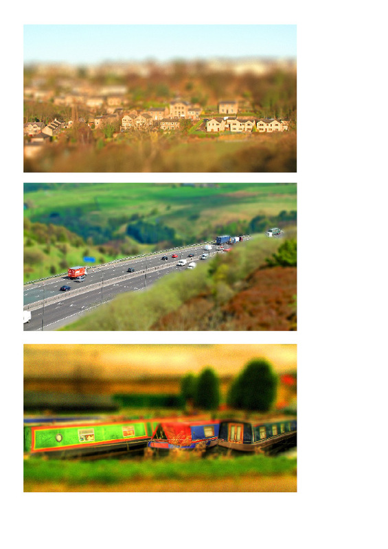
Five pieces of my work (unrelated to the course) have been selected to be exhibited at an art gallery in Sheffield. The exhibition, entitled 'Miniature' features work by various artists all of which must be no larger than a £20.00 note. I chose to submit five tilt-shift shots of real places, which I treated to give the impression of them being miniature. Each piece is priced at £55.00 and is presented in a frame. The exhibition is being held at The Cupola Gallery, Middlewood Road, Sheffield S6 1TD from March 16 - April 22. Below are the shots.

Study Visit: Royal Photographic Society - Barnsley Civic Gallery 09/03/12

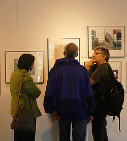
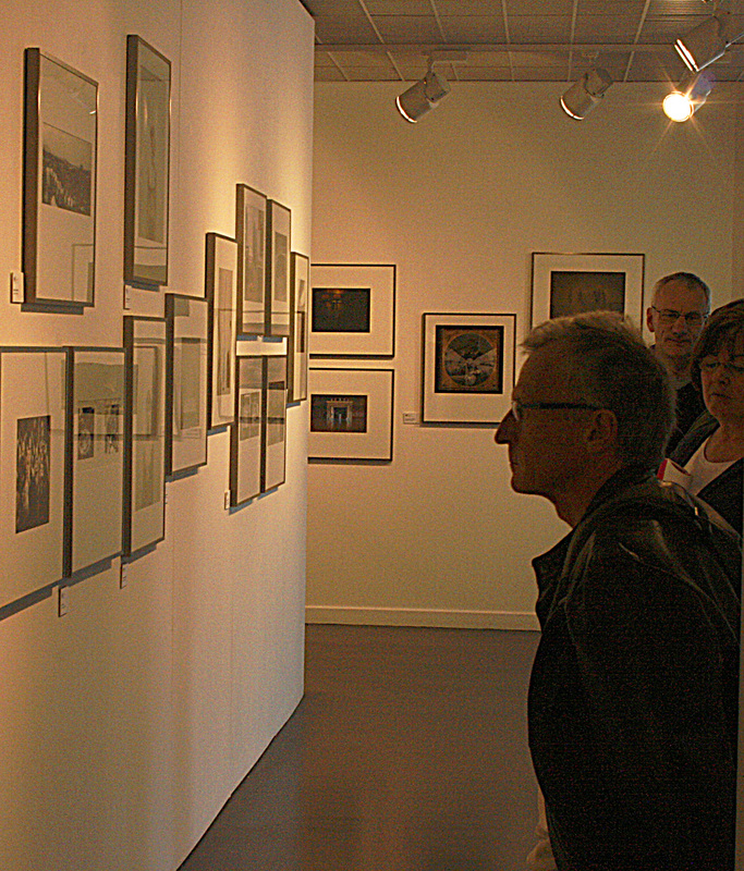
This was my first Study visit with the OCA and one I enjoyed tremendously. The exhibition we visited was a travelling one by the RPS and featured award-winning photography from selected associates/members/fellows etc. The event was hosted by Gareth Dent, Jose Navarro and Maggy Milner all of whom, cleverly prompted discussion, critique and conversation throughout the group which, I estimate, to be around fifteen.
Luckily, we had the gallery to ourselves and it was suggested that we broke up into small groups and pairs and wander around to discuss the exhibition.
Fellow student, Peter and I found that we had a lot in common regarding our thoughts, likes and dislikes about the photographs so we viewed together.
One of the first things that struck me was the apparent random method of hanging. There didn't seem to be a theme, except in a few cases. Upon entering the gallery, the first photographs to greet you are the 'Gold' winners, followed by the 'Silver' ones, so I guess that is theme enough! But the rest of the exhibition did appear random.
My thoughts on this were twofold. Firstly, it is a travelling exhibition so did the gallery staff arrange the hangings? Secondly, if the hanging had been themed - landscapes, portraits, nature, etc., would every visitor look at every section? The randomness, in my view, encourages visitors to look at each picture, rather than being selective.
Variety is the spice of life
There was a large number of photographs to view, on a wide range of topics. In my opinion, most were great, some not so great and a few left me struggling as to how they ever made the exhibition. Had I taken them, they would have ended up in my recycle bin. But that could be my ignorance, though my thoughts were echoed by others.
As we viewed the pictures, we discussed the merits of and tried to analyse each of the photographs. What was the photographer trying to convey? How had the shot been conceived? What message did the viewer see? Were they 'staged' or was the shot a moment captured?
I haven't included any examples of the photographs on view for one main reason; it was nigh on impossible to get a decent, glare-free shot in the time allowed. Also, I didn't want to openly criticise or favourite any particular photograph. Suffice to say that I had my favourites and disasters!
One thing I did notice was that all of the portrait shots bar none, were of a serious, expressionless nature. I liked this, but was left wondering if this is the current trend for portraiture. Are we meant to wonder what is going on in the minds of these people?

|
There was a large selection of black and white photography, including landscapes, portraits and wildlife, all of which I found quite stunning.
Some obvious and nicely treated HDR shots also featured, as did some over-processed Photoshop disasters! There were some beautifully composed images which put me in awe of the photographer and conversely, there were a few contrived ones where, in my opinion, the photographer had tried too hard. And, there were a few which I found technically lacking. But, on the whole, the exhibition left me happily inspired. |
|
For a little fun, each of the group was asked to vote for their favourite photograph, the one they would have awarded first prize to. I was torn between two photographs so opted to split my vote. Both my choices came first and second!
After the exhibition, the group retired to a nice cafe bar for coffee, cakes and in one case a huge scone! Much discussion and analysing transpired and one particular topic that provoked discussion was about some of the photographs (the main award winners) being accompanied by an artist's statement; i.e. an explanation describing the story behind the photograph and the reasons behind it. Personally, I don't agree with it. I think that the viewer should interpret the image and glean from it what he or she sees.
All in all a thoroughly enjoyable study visit, wonderfully hosted and a great opportunity to network with fellow students. As I write this, I am very much looking forward to my next study visit in Bradford. Thanks to everyone concerned.
As for online degrees being subject to exemption of presentation of a portfolio for joining the RPS, we shall have to wait and see what the powers that be decide.
Update
Following a message from a fellow student, I have decided to comment on several of the photographs. I am unable to give the titles/photographers names, but those who visited the exhibition should know which photographs I am referring to.The group's (and my) favourite was 'Recess' - the shot of the two kids asleep on the high table - much discussion about whether it was staged or not. I believe it must have been - where are the other kids from the school? - nonetheless, a superb capture. We also liked the Buddist boys playing football (left of Recess).
The blurred image (Gold winner) - first shot on entering the gallery was an odd choice IMHO. Should a photograph need to be explained as this had to be? Also, on the same wall, the shot of the girl at the desk made up with lipstick etc., caused some controversy, until you read the description once again. Some of the group felt the girl was being sexualised on first impressions. I particularly liked the shot of the girl in the feather outfit, taken by her mother. Very creative in my opinion. The written explanation for this lost me somewhat though.
Strange to see the EDL shot for me. I actually covered one of these demos myself: http://www.flickr.com/photos/27425313@N07/sets/72157626811688507/detail/ if you're interested! Mine were taken at the Dewsbury march.
Many of us liked the b/w wide angle shot of the old guys in a bar with the laptop. I felt it was spoilt by a couple of the onlookers in the photo who were obviously aware that something was going on re the photographer.
I totally didn't get the shark in the office, nor the over-shopped collage with the badly place apples, lamb and snake. I thought they were poorly executed and badly done. I loved the dark gloomy b/w shot of the elephant - very powerful, wonderfully lit and loved the way the tusks stood out in bright white against the dark background.
Another couple of shots that provoked much discussion were the 'Closer to God' series - the two nudes with facial deformities. I thought they were beautifully shot, with great skin tones, but I also felt they were voyeuristic, especially the profile shot which emphasised the face. Others disagreed with me claiming they were reinstating their proudness and beauty, despite their deformities.
Other great shots for me were the ship builders walking up the bright orange steps, Robert Lindsay and the two boys portrait just above it. There were some pretty uninteresting stuff there too - camera-phone, snapshot quality in my view. And yes! some were over saturated and over processed.
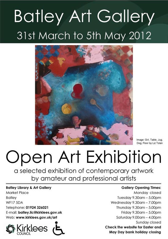
More exhibition success
With 168 artworks by 78 artists, Batley Art Gallery’s 2012 open exhibition promises something for all tastes!
A truly diverse selection of work, created by local amateur and professional artists, includes a wide variety of local scenes and landscapes from further afield – Batley to Dewsbury; Sheffield to Suffolk; Australia, Albania and India, to name but a few of the places depicted. Maritime images have been popular this year, as have flower and animal images, life studies and portraits. Also on show are some bold, striking abstracts, including the paintings of Liz Tolan (whose work is pictured on the exhibition poster) and lively, colourful fantasy landscapes by Katrina Avotina; both artists had their work featured in last year’s exhibition. Other artists with work on display include Tony Noble, Eva Mileusnic, Trafford Parsons, Jane Galvin, Martin Lyons, Mary Follows, Amanda Hunter and Barry Midgley.
For the first time this year, visitors are invited to vote for their favourite work of art. The winning artist will be awarded an exhibition in the Art Kiosk at Batley Library, to be staged in early 2013. Come along and cast your vote! The gallery is situated on the first floor within the library building, and is accessible via stairs or lift. Entry to the gallery is free.
Here are the works...
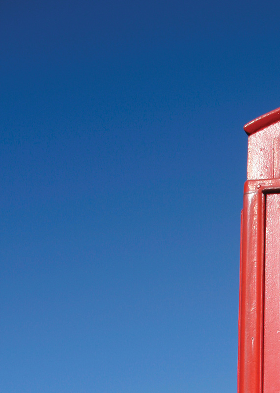
Red
|
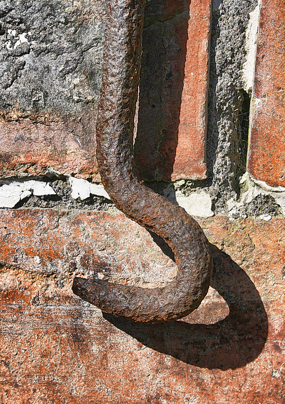
Amber
|
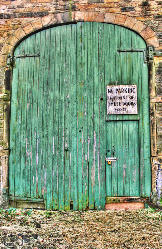
Green
|
